Thursday, June 11, 2015

renaissance project comparison

Tell your audience the purpose/intention of these 2 very different uses for Graphic organizers.

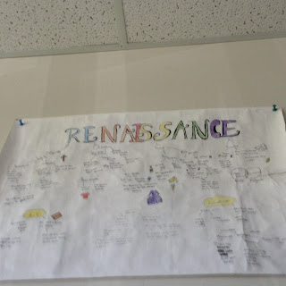
For the religion graphic organizer its purpose is to be a background, as in the presenter can say their information instead of making the audience read the information on the graphic organizer. Too much information on the poster can distract the audience and it uses images instead of words. For the renaissance graphic organizer its purpose is to make the audience read the information on the graphic organizer making them understand what their reading.


For the Religion poster - Reflect and Review
  • I use key words and phrases instead of sentences
  • Images that I drew on the poster/graphic organizer were big enough to see
Wish: Double check, I should double check my work before making it my good product
Because I see some mistakes in my religion graphic organizer like misspelling Sikhism and Catholicism.

For your Renaissance poster - Reflect and Review
Self assess- I think I deserve a B because I mostly use words than sentences and I use colours to represent main ideas and topic. I also use diagrams, like the venn diagram and T chart. I didn’t use any novel notes which makes my letter grade lower.

What did you learn from these two assignments?
I learned that the religion poster and renaissance poster have a different
Purpose/intention.
What are you most proud of?
I am mostly proud of my renaissance poster, because I put much effort on it.


definition poem

A  _____
Is like
Two friends
At the end
Trying to meet
each other;
no matter how long
they have
to meet
they will go through
rough time
just to meet
each other.

Tuesday, June 9, 2015

Definition Poem

A ____
has two hearts
one that beats,
maintains life,
the strongest muscle,
precious and valuable
demanding health.
The other,
shows affection,
takes pain,
can be warm, can be cold
hides misery.
When one is hurt,
it heals over time,
recovering slowly.

Monday, June 8, 2015

GH and Renaissance comparison project.

2 Stars: Religion 
1. It has a lot of colors 
2. Took my time to work on it, and took time to make notes.
Graphic organizer is one of the most important thing in your presentation. Audience will stay focus on your poster or presentation as long as you have visual aids.
1 Wish:
in the near future, i would work on the colors of my religion poster, and make it a little bit more bold, for the colors to stand out for the people to see my writing from a distance. And if I were to help younger students, i would tell them to make the writing a little bit big, but not to big, and colors so the teachers are impress.


Renaissance: For my project, there are some minor flaw, but all this school years, my work habits always gets in the way. This time, i focused and spend my time working on my project. And this time, i got the courage to hand my project in proudly. What makes it special you ask, well, i took as many notes as possible, tried to put it on my own words, then made the most out of it. I followed the criteria, but my art skills are too vague and my design are a bit sketchy. On the other hand, some of my categories needs more information. But overall, my project, is either B or C+, because some of my categories needs a little more work. But, while I am doing this, I spend a lot of time making it into my own words, drawing, and planning. So my project deserve a B.
What I learned: for what i learned is that how to make a proper graphic organizer. And how to easily draw a decent picture.

Definition poem


The ____ is like a one way highway, 
never ending rapids of water going on 
to a distinct location. 
two sides are called
silence
and  one is called deadly
the other side is peaceful.
while the other side is waiting for an opportunity.

Thursday, June 4, 2015

Definition Poem

A Fire 

A Fire
has 2 faces,
one of purity,
one of destruction,
the face of purity
cleanses, allowing
things to begin anew;
the face of destruction
crushes, destroying all
who may stand against it;
when one face shows,
the other will soon follow.
           
         Evan M


Wednesday, June 3, 2015

Religion & Renaissance Project Reflections

Religion & Renaissance Project Reflections


1. 

1.

 2. Religion Poster: 

Star #1 There is a lot of pictures for each religion 

Star #2 It mainly serves as a visual aid with little to no words on it 

 
  Like I said before this graphic organizer is meant as just a visual aid and nothing more. it would be very hard to make sense of it without the presentation. It needs the support of the presentation or it won't work.


1 WISH: If there is one thing i could change about my religion poster it would be to make it a less bland and more eye catching. Like it looks very basic with cut out images and outlined words, no real colours or anything worth paying to much attention to. For example if you were at a open house presentation and you could walk around and look at different projects, this one wouldn't really catch your attention. That's what i would change about my religion project.

Renaissance Project:

Self Assessment: Overall i think i would give my renaissance project a B because  of several different reasons, some negative and some positive. Let's start with the positive, I think the projects good because of the font used which makes it look  much like the sort of writing you would see during the renaissance as well as having enough content to support itself. Also as a side note some things you may not have seen due to the quality of the image (sorry!) is the legend and border as well as colour coding. It has practically all of the criteria  needed for  an A t as well as other things that didn't need to be included such as a border. The negatives of this graphic organizer are that it does not have one of the things needed for an A; a diagram. Another is that the background is not coloured however that might have interfered with the colour coding. The last negative i can think of is a bit too much text but other then that i think it's a good project. The reason is it fulfills the requirement of being able to support itself without an additional presentation for it to make sense. It can make sense on it's own. So overall yes I would give this project a B.

What I Learned: I learned how to  organize information graphically without over loading the page with text and how to make a proper visual aid. I was most proud when i finished the renaissance project.